Let’s consider some of the most important aspects that will lead you to successfully master the technique.
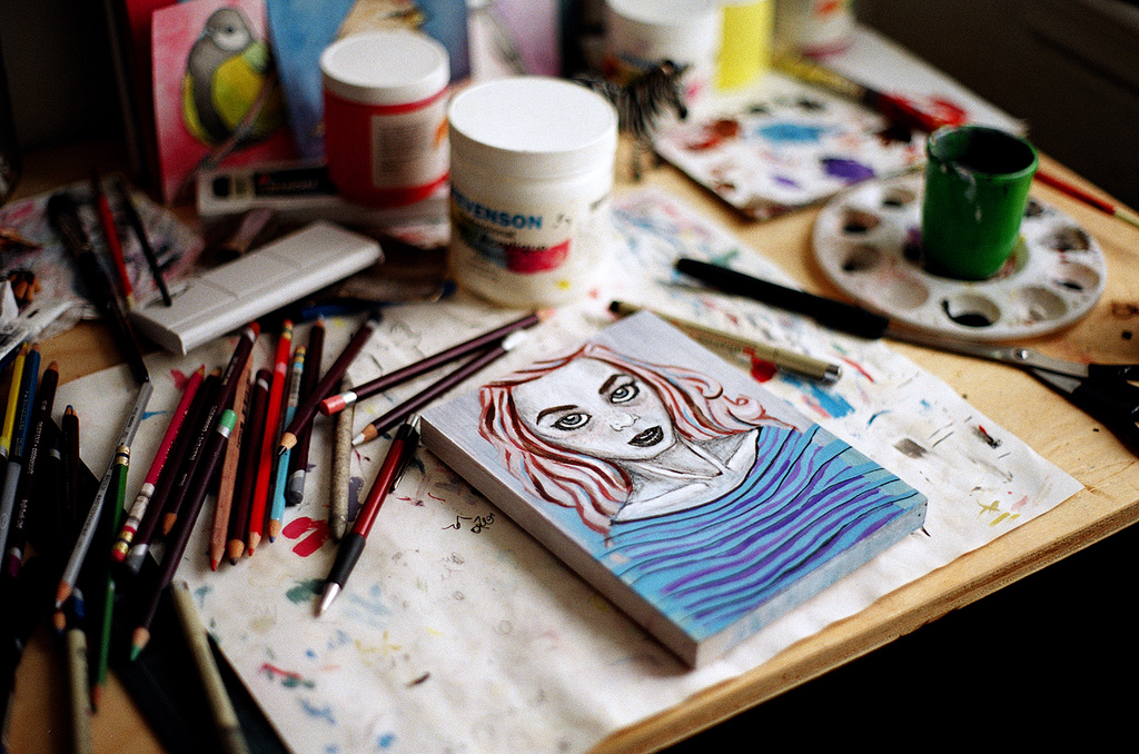
Set up your supplies and work environment
It can be a great idea to have a designated space with shelves and racks to store your supplies and paintings.
When starting you can use a flat surface like a table to avoid washes to run down. As you gain practice, you can move on and use an easel to work the paper upright. Even though many professional artists prefer to work the paper horizontally, it can be a matter of choice.
You could also alternate the way you work depending on the technique you are using in a specific painting, whether you are working on wet or dry. A 30-degree can be an optimal angle to work.
There are table-top easels designed to work with watercolor that you can incline from vertical to horizontal. This way you can work at any desired angle.
Keep in mind: Before getting an easel, you should do your research and find out what best suits your needs. There are all-in-one easels which include a tray to hold your supplies.
However, you don’t need to spend so much when learning. You can use your table. Look for the way to keep all your supplies organized. I suggest you also get a brush organizer so you can work comfortably and have them always at hand.
If you like painting on the go, you can learn how to create your travel watercolor kit on https://www.craftsy.com/art/article/travel-watercolor-kit/
Learning to draw

When you create a sketch before painting, you don’t have to make any drawing gradations. You must limit drawing to just lines. You must also draw with lines the different tones as a road that will help you know where exactly playing with specific values and tones.
Make sure that you use a soft line pencil (HB) so that the paints can easily cover them.
Stretch watercolor paper
Before attempting to apply any brush-strokes, it is necessary to prepare the paper by stretching it to avoid it buckles when applying washes on the surface. Stretching is applied to lighter watercolor papers. Even though there are different ways to do it, we are going to show you the simple one. This is a method to prepare the paper to start painting immediately.
The first step is to saturate all the way the surface of the paper with water. Then do the same on the back side of the paper. Then leave it for about 15 minutes. Cover the surface of the wet paper with two layers of paper towel and press all over to absorb any excess of water. Now, you are ready to start painting!
If you would like to know more about other methods of stretching watercolor paper, you can go to https://www.strathmoreartist.com/blog-reader/stretching-watercolor-paper.html
Basic techniques to learn watercolor painting
For our purpose of starting with the technique, we are going to see the basic techniques that will allow you to begin experimenting the dynamic of the paints on the surface of the paper.
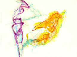
Washes.
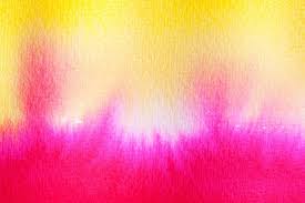
This is the most basic technique to paint a specific field of color. Let’s try to figure out how to do it correctly. With a load brush apply horizontal strokes, only one brush line at a time slightly overlapping the previous stroke. You can also apply graded washes. Simply add more water to the stroke to lighten and more pigment to darken. Take time to practice how to create different contrasts with the same color.
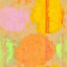
Glazes.
This technique is about applying a transparent stroke over a previous dried layer. So you can see through it the underlying color. Colors can be diluted when applying a new layer to create a more dynamic effect of color transition.
Dry brush.
Knowing these techniques will help to work accordingly and see the expected results.
Understand composition
The arrangement of visual elements is another key aspect of achieving an appealing artwork. How to arrange elements in an artistic composition is not a new trend. From ancient times, there was a holistic appreciation of art.
Let’s then discover what makes those artworks we admire so magical.
The key elements must be placed alongside the lines or at intersecting points. This will make the viewer focuses on the main matter of interest, or get the idea and feeling the composer tries to convey.
This dynamic way of arranging the elements is what makes any composition vivid and engages the viewer, taking the eye from one focal point to another one. This way, the eyes keep moving around the picture.
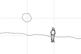
Landscape compositions
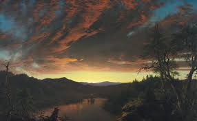
The rule of thirds is most often known as a guide to composing landscapes but can be applied to any subject as well. If you appreciate some landscape —either photos or paintings— you’ll observe that it is common that one-third of the frame is occupied by the land, and the upper thirds are reserved for the sky and space. But some elements such as trees, a building, a mountain, etc., can stand out from the assigned space and extend to the other thirds.
How to use the rule of thirds
There’s not a specific rule on how you are going to place the elements, but you have to make sure to use lines and intersecting points as references where to place your focal objects or the matter that you want to highlight.
For example, if you place the main subject right in the middle, it might look kind of monotonous and will bore the viewer. But if you play around and place your subject in an intersecting point, that will have a sense of challenge to the viewer that will make the composition appealing.
Something really interesting to observe the rule of thirds is that when placing the subject at one of the intersecting points, that will leave space for the remaining field. If you place a subject like a building in the upper intersecting point at the left or right, the foreground won’t be divided, but you’ll observe an extended area that invites you to be part of the scenario.
Also notice that sometimes the sky will occupy two-thirds of the frame, other times, the ground or elements at the bottom do so.
The rule of thirds is more like a guideline that will help you with your creative process. You have to play around until you find the composition frame that looks the best.
It is also important to understand some elements and principles that give a painting its consistency. I will help us avoid being predictable in our composition.
Line
The line is the most basic element we can find in art. It is used in endless numbers of ways. It can control perspective, define edges and form, suggest movement; it can also emulate values and the source of light in the drawing.
Shape
The simplest way to think about the shape is as a closed contour. So it makes sense to draw an enclosed line to create a shape. They help us create complex sketches and artworks. They define a balance in the work when creating a correct proportion.
Form
This element helps us create 3-dimensional object effects and define their relative width and height. If we look around us, will see that everything is made up of forms. Understanding of form is key to give the illusion of realism. We can understand form better when observing how light reacts on an object.
Value
For value, we understand how dark and how light a color is. We can measure value on a scale. Lighter values are called “tints,” and darker ones are called “shades.” Value has such importance since it creates the illusion of light.
Space
We can understand it as the free area around and above an object. In artistic creation, we create the illusion of space. There are different ways to achieve it. Overlapping, when simulating an object is behind another one. Placement, the higher we place an object, the further it seems. Size, smaller objects look further away. Color and value, objects that are far away are colder in color, while closer objects are warmer. Perspective is also key to creating the illusion of space.
Texture
Emulates the way objects surfaces look. Playing with values is key to create the illusion of different types of texture —smooth, rough, shiny, silky, and so on. Texture produces interest, points of focus, contrast, and balance in a composition.
Color
Three aspects can help us understand color in a simple way. The color wheel that classifies colors as primary, secondary, and tertiary. Color values refer to how dark or light a color is. Color schemes have to do with smart ways of combining colors.
The concepts we’ve talked about can give you an integral view of the different techniques and elements implied in the art of watercolor painting.
Try to identify the different elements we’ve talked about by appreciating the art of other artists. Begin experimenting with the basic techniques so you can enhance your comprehension practically.

This was very helpful thank you I would love more.